- Microsoft’s new Photos app brings a new interface, but it’s virtually the same as the old version.
- The new interface features rounded corners, new animations, and visual styles to match the Windows 11 language design.
- It’s not yet available but it soon should arrive for Insiders.
Microsoft is building a new Photos app for Windows 11, which includes a new modern interface that follows the same design language that the company is pushing with the new OS using WinUI. (The app is now rolling out to Insiders, and here’s a first look.)
The app is not yet available, but Microsoft’s head of Windows and Devices, Panos Panay, teased the new design on a short Twitter video. The video reveals that the app retains the classic look and feel, but it includes changes that should make it easier for users to organize and edit their pictures.
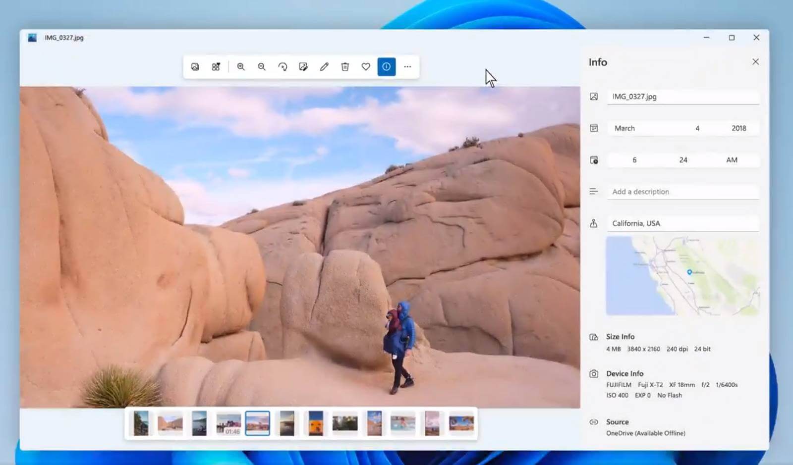
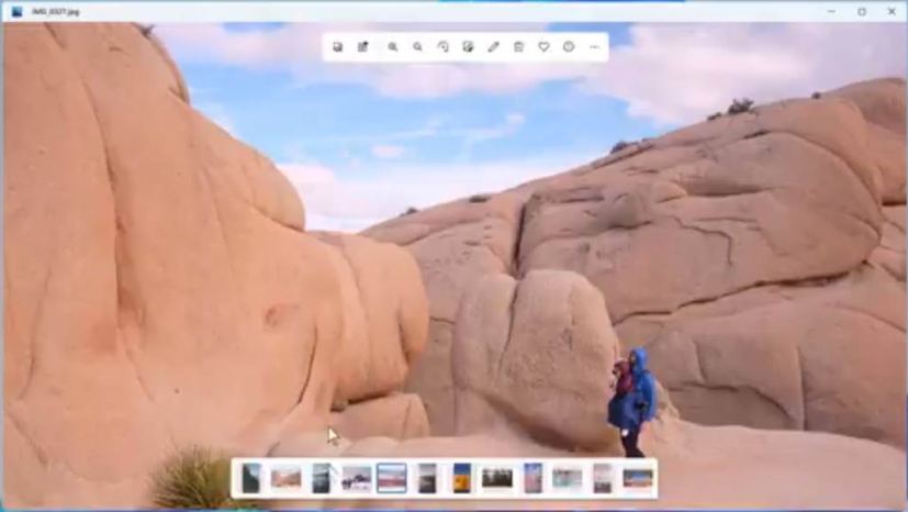
The new Photos app still has the same main page divided into five categories: Collection, Albums, People, Folder, and Video Editor. Selecting a picture will now open taking the entire canvas of the application, and floating elements will give you access to the commands. And the bottom tray will surface additional images you can select to view and edit a group of pictures.

The video teaser also shows that clicking the info button will now also include a map showing the location where the picture was taken.
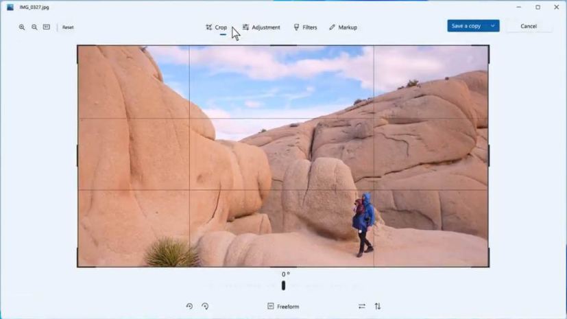
The command bar to edit an image now includes a “Markup” tool that allows you to annotate the picture. Also, whether you use the Crop, Adjustment, or Filter features, the tools will appear at the bottom of the screen instead of the right side.

Overall, the Photos app appears to be almost exactly the same as the one available for Windows 10, so it seems that Microsoft is not trying to reinvent the app, but rather it’s just tweaking it to make it feel more like an app that belongs on Windows 11.
This is not the only app that Microsoft is updating. The company has also started testing new versions of the Calculator app with an updated design and a tweaked version of the Mail & Calendar apps. It has already introduced a new Snipping Tool that merges the legacy Snipping Tool with the Snip & Sketch app. There’s a new Alarm & Clock app that features a new “Focus Sessions” with Spotify support. And, soon, there will be also a new Paint app with dark mode support.
