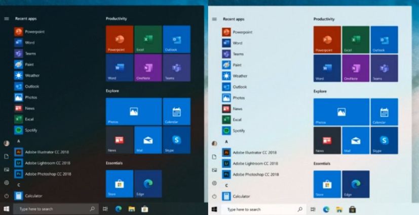
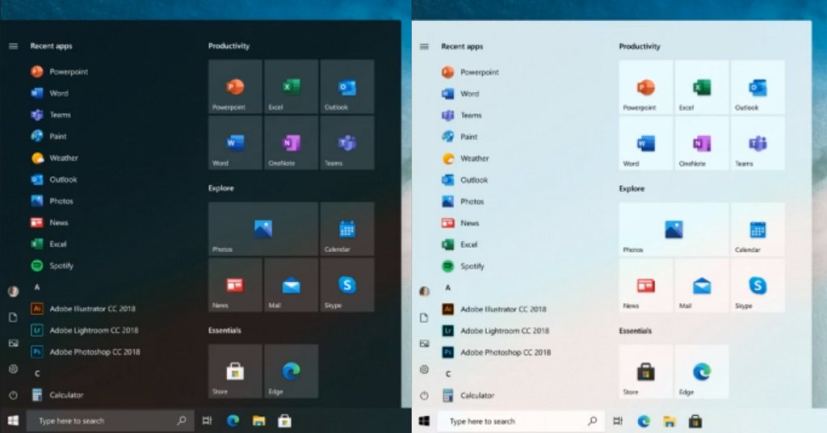
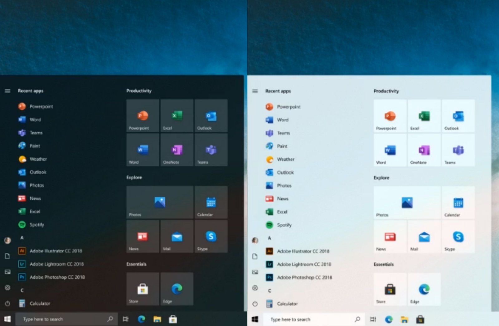
Microsoft is planning to introduce a new Start menu for Windows 10 that ditches the Live Tiles in favor of traditional icons, and the company unveiled a possible design during its Windows Insider Podcast.
The new menu continues to follow the same design as the one you see today on Windows 10, but it’s visually different. According to the company, the menu tracissions from a “chaotic color” to something more uniform. You’re still getting tiles, but Microsoft will be reducing the color of blocks to match the menu color scheme and uses traditional icons designs that should help to make easier to scan and find an app quickly.
When Microsoft first introduced Windows 10, the desktop shipped with a Start menu that combined the familiarity of the Windows 7 menu with the Start screen Live Tiles available with Windows 8.

While the Live Tiles were an innovative idea at the time, as they were meant to give you a quick glance in real-time of things happening within the app, the approach never was really adopted by developers.
It’s interesting to see that Microsoft will continue with the titles design, despite the company already building a new Start menu for Windows 10X that no longer has tiles and includes a more intuitive design, where you quickly access your apps as well as your recent files.

Although it’s yet not clear when the new Start menu will be available to the desktop version of Windows 10, Microsoft has recently started rolling out updates for many of its apps that include new modern icons using the Fluent Design System which will be part of the new Start menu.

