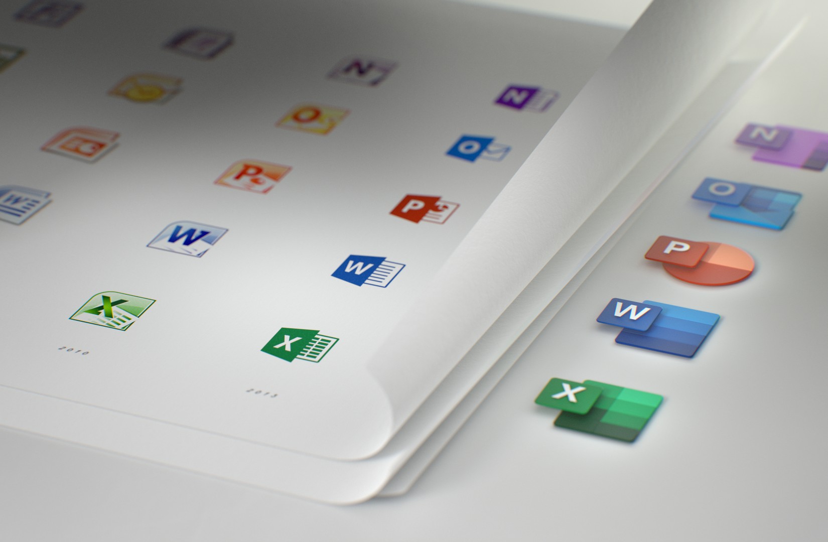
The icons for Office apps are getting a significant makeover after five long years. However, the change isn’t random, Microsoft is modernizing the icons to represent how the most popular office apps in the world have been evolving, and the new development direction, where the apps now share the same codebase across devices and platforms (Windows 10, macOS, iOS, Android, and web), which allows the company to push more updates rapidly.
According to an article from the company on Medium, the new icons no longer focus on the letter in the name of the app, but users will still find them familiar to the old version.
For example, in the new icon for Word, the icon is designed to represent the document lines, and in the case of Excel, the icon includes different shades of green representing the cells.
Among other new icons, you’ll find a new icon for Skype, which maintains the same shape, but now it features a flatter design and different shades of blue. OneDrive continues with the same cloud design, but with multiple shades of blue overlapping with each other. In addition, OneNote still very recognizable, but now its icon represents a notepad with section dividers.
Alongside the new icons, Microsoft will soon be introducing other subtle changes for its popular Office apps, including a simpler to use ribbon, visual improvements with Fluent Design, and more.
The new changes are expected to rollout in the coming months, and Microsoft will begin updating its mobile applications and then it’ll expand to the desktop and web.

