Microsoft’s Fluent Design System was first introduced in 2017, bringing a new interface design language to Windows 10 adding blur, translucent, and animation effects. If you’re running version 1803 (April 2018 Update) or version 1709 (Fall Creators Update), you’ve already seen some of these changes, but during its Build 2018 conference, the software giant is revealing a number of improvements coming this year.
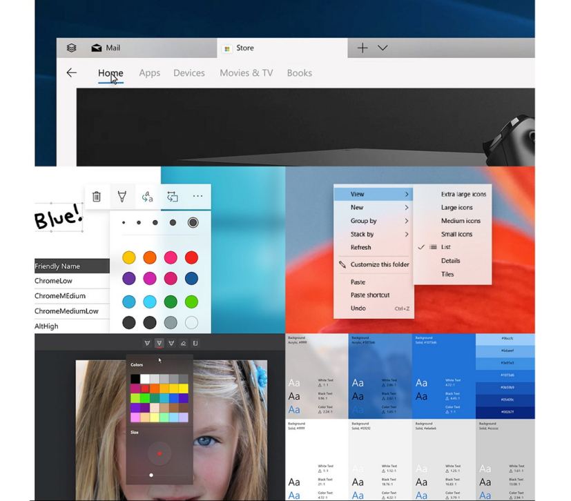
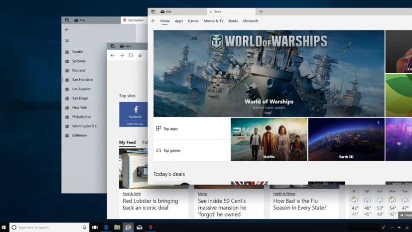
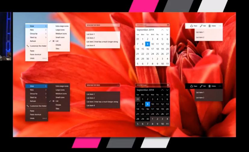
In a developer session (via The Verge) at the conference dedicated to Fluent Design, Microsoft revealed some changes that we will see in app for Windows 10, including modern context menus using the Acrylic effect, consistent back buttons, and shadow effects.
The improvements are subtle, but it should help to make Fluent Design more consistent and more beautiful across Windows 10 and apps. However, it’s up to developers and even Microsoft, to bring the new changes to apps.

As part of the changes coming to Fluent Design, you’ll see shadow effects that are meant to offer a sense of depth in applications. In addition, Microsoft is recognizing that many controls to build modern app are large, as they’re optimized for touch. To address this issue the new system will offer smaller controllers, and even a compact mode.

Currently, developers can place the back button in multiple places, which is not consistent, but with the new Fluent Design changes coming in 2018, the back button will be in a placement that is more obvious and consistent. The navigation changes will also include support for Xbox One controllers and keyboard shortcuts.
Microsoft is planning to bring these Fluent Design changes this year, which should help further modernize Windows 10 and applications.
What do you think about the design changes coming to Windows 10? Tell us in the comments.

